Which Wrap Design Suits Project MX-5 Best?

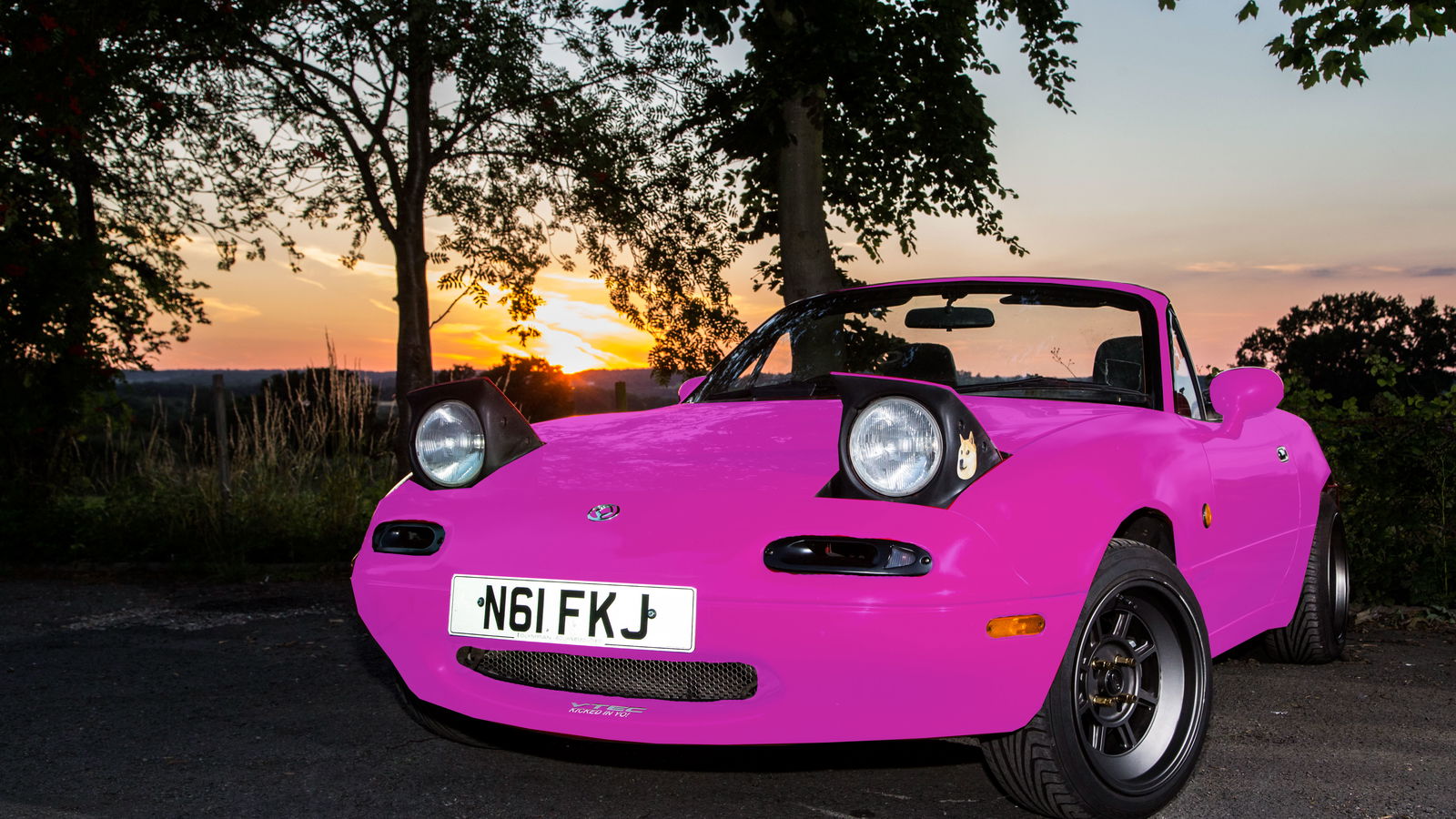
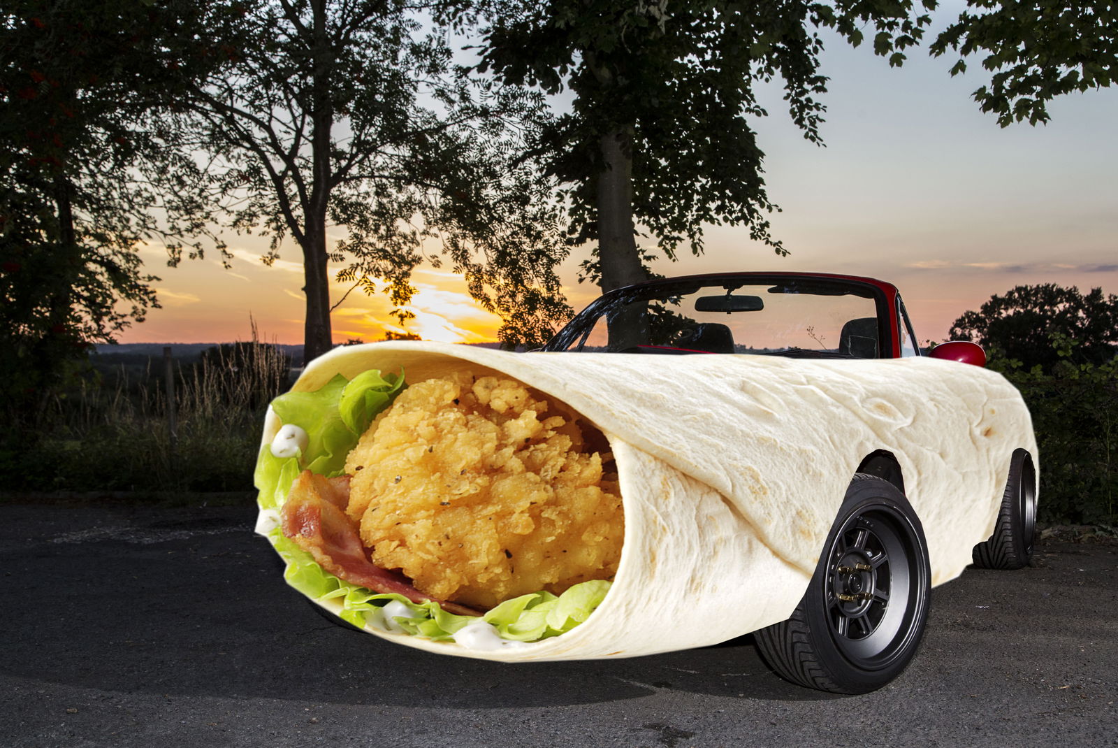
A few weeks ago, I asked you guys to help me out with a wrap design for Project MX-5. Unfortunately, Features Ed. Darren got in on the action and designed the wrap you see above. You all clearly hate me, which is why you all UPVOTED this design to hell. But I won’t do that to Phil, and nor will I go for the literal wrap below (I know, I’m boring)…

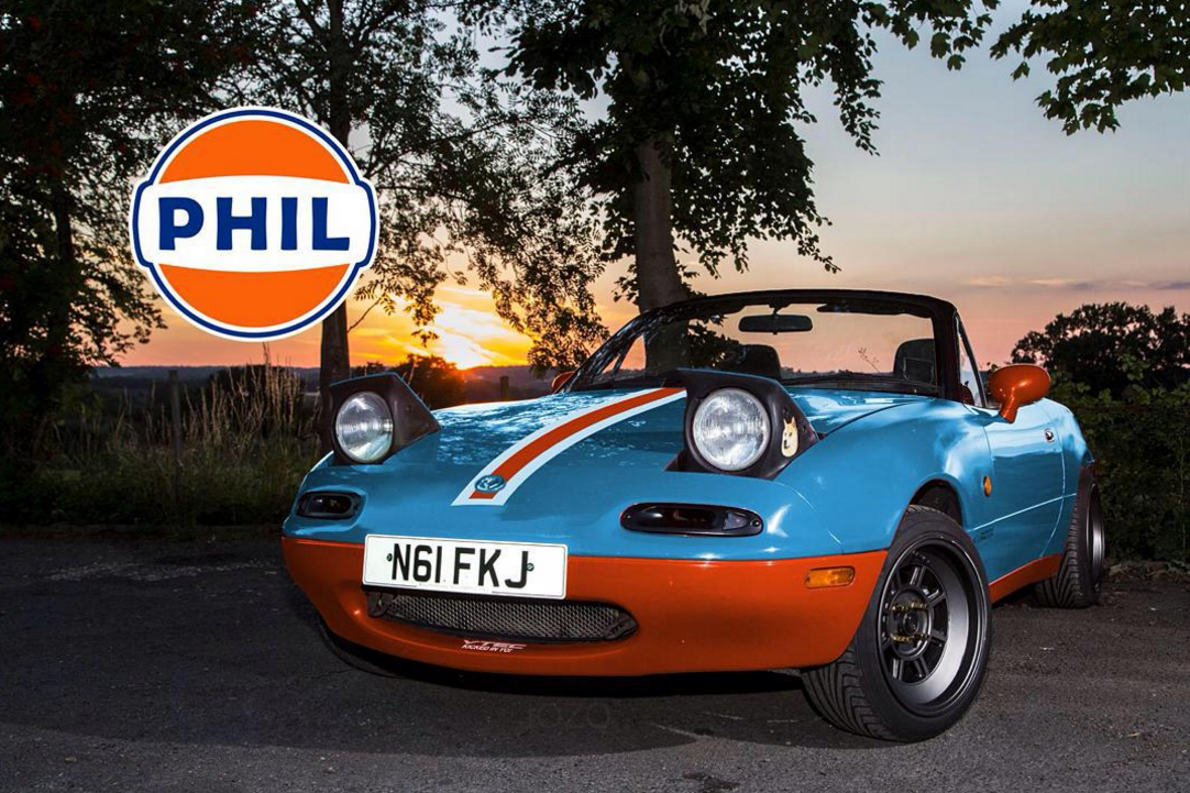
Also in contention was a Gulf livery, created by Joseph, that looks insanely good, but is something that I think I’d tire of quickly; Mazda has no real links with the livery, after all…

Now, however, CT’s Head of Design, James Southorn, has waded in with a few designs that I like the look of. They suit the MX-5 curves, make the car stand out for the right reasons, and won’t make me duck my head in shame. In fact, I reckon that Chris Harris would enjoy driving Phil if it looked something like this….naa, who am I kidding?
Anyway, here are your options from the man that made you the famous HH CT logo that you all love. So please, vote for your favourite design below, or feel free to suggest/mock up some colour combos that you think would work well too!
From Phil and I, big love!
Comments