5 Reasons Why In-Car Media Systems Infuriate Me
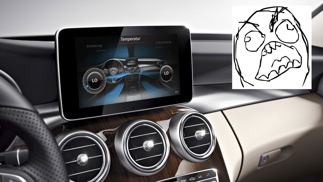
Cars are increasingly stuffed full of electronics these days. In many ways, this is a good thing. In other ways, it’s not such a good thing. One particular gripe I have when it comes to car technology is the central media and navigation systems many manufacturers use. All too often they overcomplicate matters, and leave me wanting to bludgeon the display screen with the nearest blunt object.
But why is that? Here are the five things that infuriate me most about in-car infotainment systems.
1. They're far too fiddly
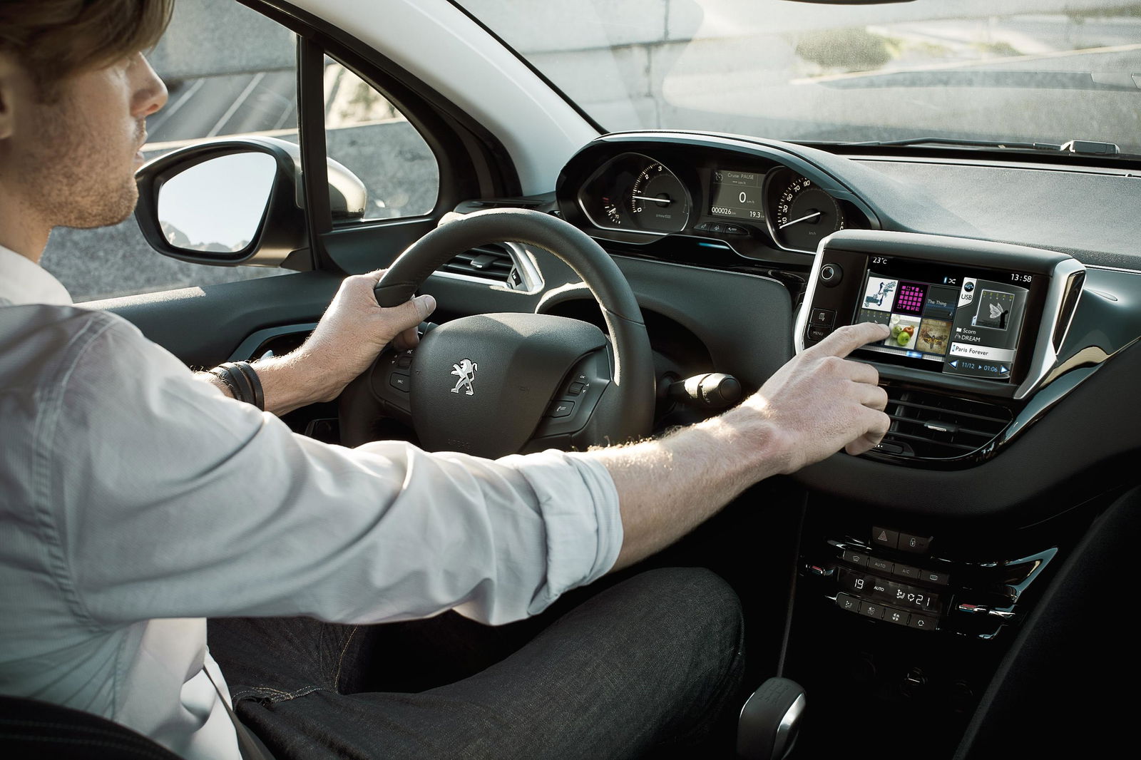
Car media systems often present you with a bewildering amount of controls, most of which are hidden in a complicated maze of sub menus. BMW’s much maligned iDrive system used to be pretty bad for this. It’s since cleaned up its act, but there are other offenders out there. Merc’s infotainment system, for example, is especially fiddly, while Peugeot’s unit (particularly the one in our old 208 GTI longtermer) isn’t the easiest to operate. And on the subject of Peugeot, many of the company’s navigation systems don’t even have a facility for postcode input. Acceptable about 10 years ago, but certainly not now.
2. Ugly screens
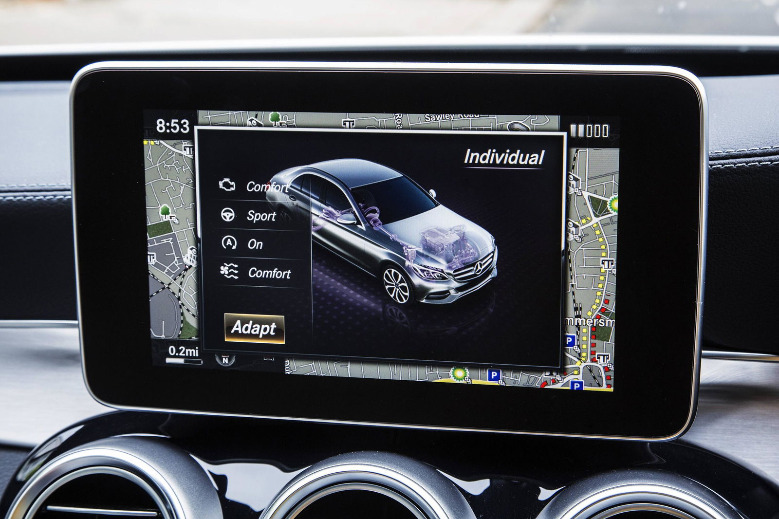
The media system in the picture above - now sweeping across the Mercedes range one model at a time - is a perfect example of this issue. It looks as though someone’s glued a tablet to the dashboard, and it looks really rather silly. You feel as though you should be able to pivot it, but you can’t because it’s fixed.
Mercedes isn’t the only company guilty of this; the media system in many Peugeots pops out of the top of the dashboard, which isn’t a good look. BMW navigation systems, meanwhile, look as though they should fold or descend into the dashboard, but they don’t; they’re fixed in place.
3. Connectivity options
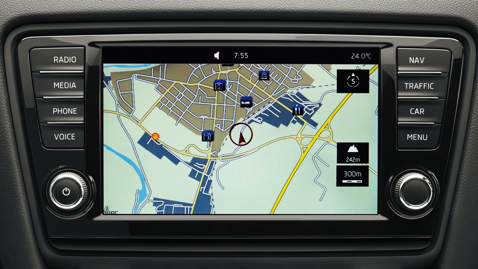
An issue with some cars from the Volkswagen group is phone and MP3 player connectivity. Many models come with a USB socket. ‘Great,’ you might think. ‘I can plug in my iPhone and play some music.’ Wrong. Plug in your iPhone or iPod, and it’ll start charging, but nothing else will happen. That’s because if you want to link up your Apple device, you’ll need to tick the right options boxes when you buy the car.
In some Skodas, for instance, you can tick a £100 box to get a ‘Mitsumi’ connection for your Apple device, which is installed in place of the USB. That’s not a huge amount of money when you’re dropping a good few thousand on a new car, but you don’t even get the link cable with it. What’s more, you’re then stuck with an interface for Apple devices; should you want to change to a different sort of phone, you won’t be able to control it with the car’s media system, and you’ll be left with a useless socket in your dash.
4. I don't want a list of songs!
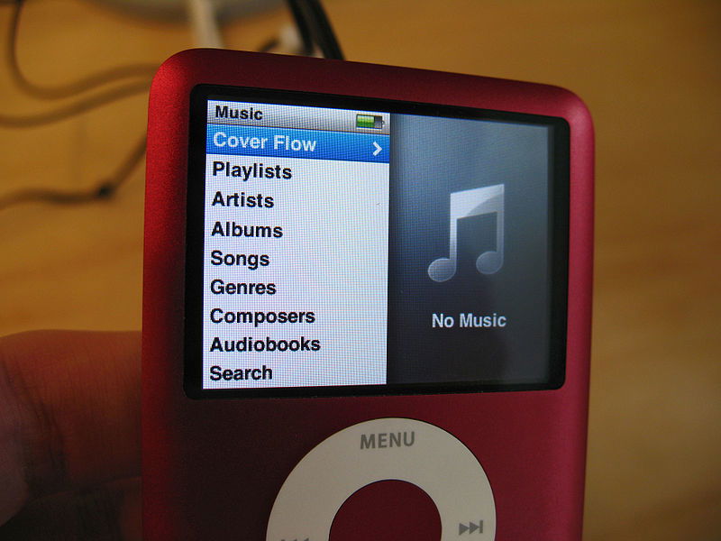
Even if you do have a media system that works with your phone or MP3 player, you’re not always issue free. Something which I cannot abide is a car’s infotainment system immediately bringing up a list of every single track on the device listed alphabetically once you plug it in, and automatically playing the first track on the list.
This causes me extreme aggravation for two reasons. Firstly, who listens to their music in this way? You want a list of albums or artists to choose from, not a massive list of songs. Secondly, it means every time you plug your device in, you’ll be treated to the first few seconds of whatever song is at the top of the alphabetical list, while you furiously punch buttons to change to something else. Mark my words, you’ll end up hating that song quickly.
5. Hazardous de-cluttering
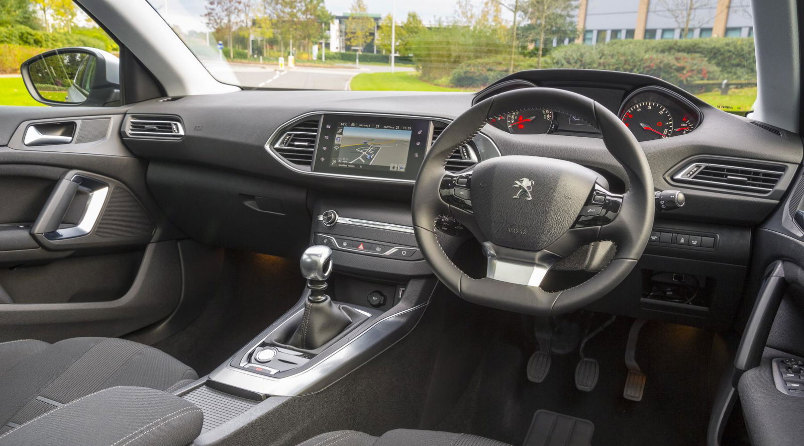
We’re all for de-cluttering dashboards, but taking away oft-used controls and sticking them into the media system is asking for trouble. Peugeot has done this in some of its cars, which has resulted in a fantastically clean-looking dash in cars like the 308SW, but it’s not an ideal setup. If you want to change climate settings, for instance, you can only do this through the touch screen display.
You find yourself taking your eyes off the road for a few seconds longer than you would do otherwise, as you tap more than one button to get the right screen up. If you have the navigation screen up, your directions will disappear while you fiddle with the heater controls. Not ideal.
Am I being pedantic, or do infotainment systems annoy you too? Voice your opinion in the comments.

Comments