6 Car Exterior Design Fails Which Make Me Angry

Last week, I had a good old moan about aspects of modern car interiors which drive me mad. And then I had another moan for good measure. But my frustrations about modern car design aren’t limited to just what’s on the inside. Oh no. So without further ado, here are the car exterior design fails which I can’t stand.
1. Bumper exhaust holes
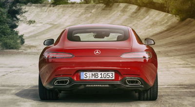
There was a time when an exhaust would either sweep down behind the rear bumper, or poke out of one or two cutaways at the back. Now, there’s a hideous third option: these dreadful hole bits. At first glance, it looks like the exhaust is integrated with the bumper, but that’s not the case - it’s just a hole in the bumper with some silver trim; look closely and you’ll see that the exhaust is set further back and is usually just a regular round-piped affair.
It’s a design crime found on many modern cars, including the Skoda Octavia vRS and - rather criminally - the new Mercedes AMG GT.
2. Fake vents and ducts
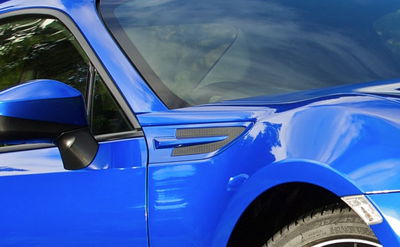
Carmakers seem to stick on fake vents and cooling ducts with depressing frequency. The Subaru BRZ, Vauxhall Corsa VXR and the old Ford Focus RS - to name but a very few - all have them. Presumably because this tat makes a car look sporty. Listen up, designers: unless it’s doing a job, don’t just stick it there for the sake of it!
3. Sloping rooflines
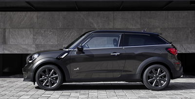
A recent design trend is to have rooflines that heavily slope downwards towards the rear of the car. It usually looks rubbish, and compromises both rear headroom and window size, so why do it? The worst offender is the Mini Paceman; it’s a horrid design feature on what’s already an ungainly-looking thing.
4. Rubbish aerials
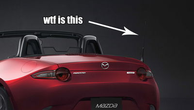
Sometimes, you get a brilliantly executed car design, and then the whole lot is wrecked by an aerial. We were a little shocked at the recent Mazda MX-5 reveal to see a nasty thing poking out of the car’s sculpted bodywork like a sort of nasty afterthought.
5. Aftermarket-looking daytime running lights
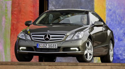
Daytime running lights tend to divide opinion, but I’m sure we can all find some inner rage at some examples of these things, particularly those that look like they’ve been bought at a local branch of Halfords and stuck on with superglue. The Mercedes E-Class, for example, has a set just like this.
6. Tacky personalisation stickers
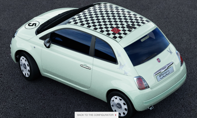
As you’ll have gathered from our well-stocked sticker store, we have nothing against a good car decal, but when manufacturers offer personalisation graphics packs on new cars, it rarely ends well. After a couple of minutes with Fiat’s 500 configurator, I cooked up this monstrosity, complete with butterfly stickers.
Think that’s bad? Just take a look at what you can put on the MG3 from new. From its huge range of graphics packs you can spec your 3 to have a load of different emoticons plastered all over the roof. Really.
Are there any exterior design fails you think I’ve missed?


Comments
No comments found.