7 More Car Interior Fails Which Make Us Mad
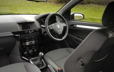
At the weekend, I had a good rant about some of the aspects of modern car interiors that aggravate me. It seems this struck a chord with you because you were quick to suggest your own car interior woes. We’ve added them all here, and thrown in a few more of our own for good measure. Can you relate to these frustrations?
1. Auto gearbox levers masquerading as manuals
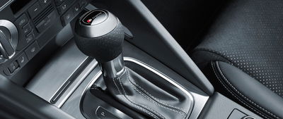
This was the top-voted suggestion on our original list. Some manufacturers - Audi, for instance - have gotten into a habit of making their automatic gearbox levers look a lot like manual shifters, with leather gaiters and a rounder gear knob at the top. You’re fooling no one!
2. Rubbish cup holders
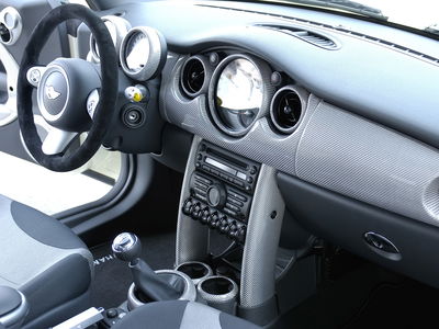
A frequently-mentioned interior gripe of yours is cup holders. They’re often placed in stupid positions - just in front or behind the gear lever where you’re at risk of spilling your precious beverage with every shift, for instance. On other occasions they’re just the wrong size to be of any real use. Anyone who’s had a bottle or cup fly out of a much-too-large holder mid-corner will know this pain…
3. Rubbish stalks
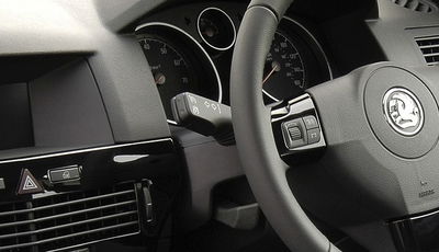
You’d think that something as simple as an indicator stalk would be an easy thing to get right, but no. Many are ugly and/or flimsy, while others are needlessly fiddly. In the old Vauxhall Astra for example, the indicator stalk returns to the middle position after being pressed. This means, if a turn signal doesn’t self-cancel for whatever reason, you have to push the stalk in the opposite direction, but only slightly, or you’ll end up signalling the other way. Infuriating.
On the subject of stalks, some newer Mercs with automatic gearboxes have dispensed with having the wiper controls on the right hand side, replacing this with a gear selector. That’s fine, apart from the fact that it looks like an ordinary stalk. Until you get used to it being there, it’s pretty easy to knock the car into neutral while trying to stick the wipers on…
4. Air vent frustration

There are numerous aspects of air vents to get annoyed about. In the outgoing Mazda MX-5, the outermost vents have a little button in the middle which can be used to switch them on or off. The inner two look to have the same button, but it’s actually a solid, dummy part, as these cannot be switched off. What on earth is the reason for this?
A CT commenter also brought up a slightly more first world problem with vents: the new Ford Mustang has three vents in the middle, so who’s supposed to get the middle one? Stop this madness, Ford!
5. Head-up displays with less of the 'up'
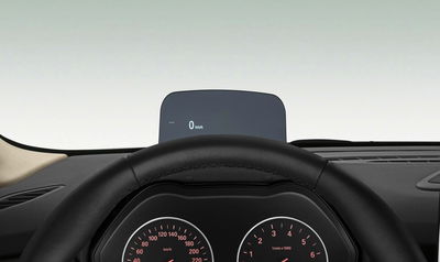
Head-up displays are a good idea in theory. Displaying all the vital information you need on the windscreen means you won’t need to look down and take your eyes off the road. But this isn’t the case for all HUDS; on some Minis and the BMW 2-series Active Tourer, you instead get a display projected on a little piece of plastic which pops up on the dashboard.
Seems good enough in press pictures like the one above, but depending on your seating position, you’ll find yourself staring down at the top of the dashboard rather than out of the window. To top it off, it’s a really rubbish-looking unit that could pass for a cheap aftermarket add-on if you don’t know otherwise.
6. Lack of grab handle
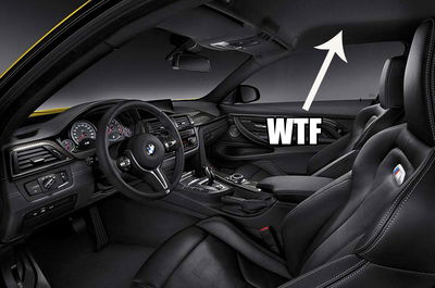
There are some cars which could really do with grab handles, but don’t have them installed. In quick cars like the Ford Fiesta ST and the BMW M4 (and all other 4-series BMWs, for that matter), your poor passengers will grab for the ‘Jesus Handle,’ only to find nothing there.
7. Seat recline handles

If you’re not lucky enough to have electric car seats, you’ll probably have a dial on the side of your chair to change the position of the back rest. These work rather well, so it’s puzzling why some manufacturers instead use a lever, which - without very careful use - can only result in you sitting bolt upright, or lying completely flat.


Comments
No comments found.