Here's How The New BMW 4-Series Looks With M Performance Parts Chucked At It

The all-new BMW 4-series is officially here, with images of its giant kidney grilles flooding the Internet yesterday. And as is the case with pretty much every new BMW model, a range of M Performance parts is available from the off.
There’s no dedicated news release for the bits and pieces as of yet, merely a note in the main 4er press pack that there will be an “Extensive selection of M Performance Parts available from the launch of the new BMW 4-series Coupe”. However, a set of images seems to show all of the items on the menu.
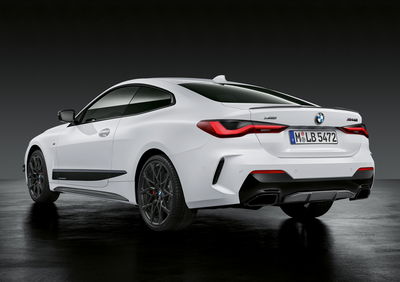
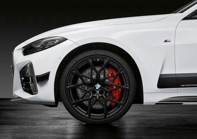
At the front, we have grille surrounds, vent trims, a splitter and mirror caps all made from carbon fibre. Looking under the kidneys, there’s a black trim piece which looks like a mischievous smile. Some new canards are sprouting from the sides of the bumper, leading to carbon fibre skirt trims and black cladding pieces that stretch between the wheel arches.

In those arches, we can see 795M-design 20-inch wheels finished in matte black, behind which sit some suitably beefed-up M Performance brakes. At the rear, there’s a slightly awkward looking carbon fibre diffuser insert, black exhaust trims and a small carbon boot spoiler.
The inside gets an M Performance makeover too, courtesy of carbon fibre panels for the dashboard and centre console. There’s also a new steering wheel with a rim partially clad in Alcantara, with yet more carbon fibre on the spokes and some CF shift paddles.

The car used to showcase all this is inevitably the M440i, however, we should imagine the vast majority of this stuff will be compatible with most 4ers. The question is, does it all improve the 4-series’ challenging aesthetic? To the comments!


Comments
Why would you apply lots of sporty trim to a car which looks very inflated and overdesigned as it is? I understand applying them on a more mundane coupe such as the old 4 series (which looked arguably a lot better) but the new design has so many unnecessary traits, why highlight them?
Oh god, it’s straight up a 9 yo wet dream
Amazingly they managed to make it look even worse. It’s absolutely vulgar.
Shame to see how abandoned this app is now
It’s not supported. We haven’t had app developers on the teams for years. There’s a reason it’s not in the app store. Please just use the regular mobile site!!
Wow, the normal one is hideous from the front, but this is worse…
That grille. Nothing can make that face pretty. Even it’s mother abandoned it.
I like the grill :)
I really like the headlights and the rear end… what a shame about the whopping great barbecue on the front. Hopefully someone on the aftermarket will fix it quickly.
Looks like a Toyota threw up on it
Looks like a Kia Stinger ran over a George Foreman grill.
Pagination