7 Automotive Design Trends That Need To Die
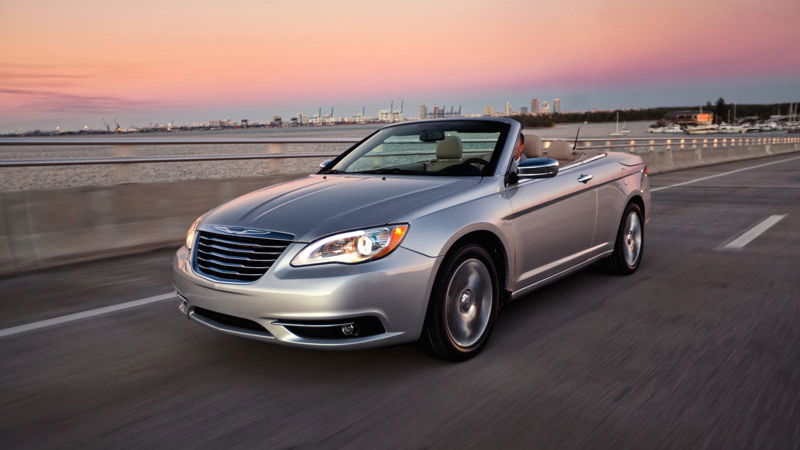
I want to make something abundantly clear. I’m not one of those guys who thinks all things new are crap and “my” generation was the best. I mean, I grew up in the 1980s for crying out loud - we thought cordless telephones, hairspray and glam rock were the meaning of life.
I say this so you won’t automatically dismiss the criticisms I’m about dish out on modern trends in car design and functionality. I promise it’s not a hardening of the attitude - Bluetooth and satellite navigation are awesome, and what’s not to like about 300bhp everyday family cars that still pull 30-plus miles per gallon? We have sinfully attractive hypercars, turbochargers galore, and freaking electric cars that hit 60mph in under three seconds, then drive themselves through traffic. Now is a very, very good time to be a petrolhead.
I just hope designers and engineers realise these particular trends need to die before it all gets ruined…
1. Big wheels
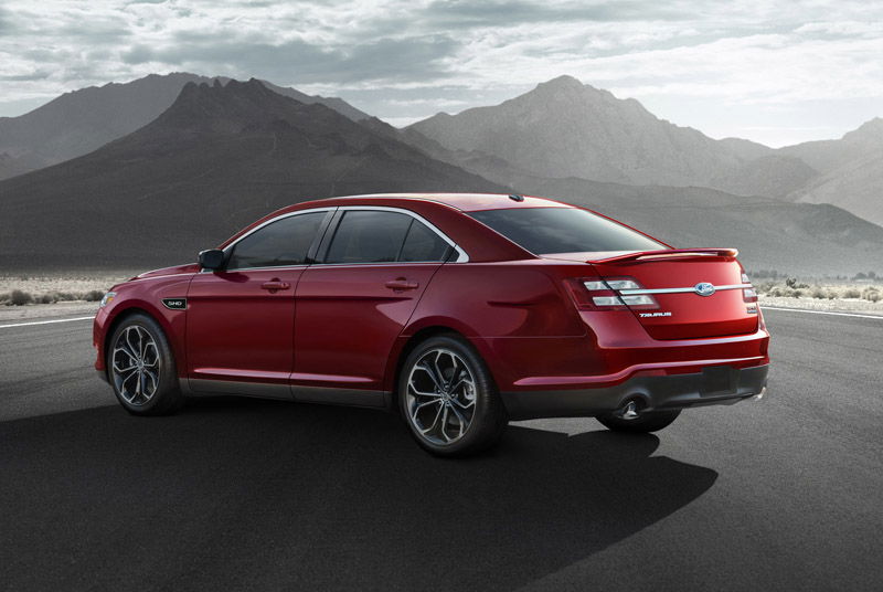
I’ve said it before and I’ll say it again. Big wheels are the enemy of performance. You need big wheels to clear big brakes, but even then there’s no reason for street cars or pickup trucks to sport massive rims. Modest 17-inch wheels offer plenty of room for a stout braking system underneath that would be just fine for street use where 99 per cent of buyers get the most from their cars. For hardcore enthusiasts, get 18s with bigger brakes and better pads, but that’s really all you need.
2. Ugly oversized angular grilles
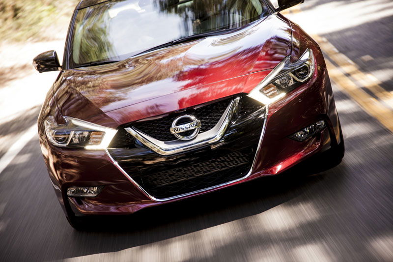
It’s hard to say when this trend actually started. I tend to single out the 2004 Audi redesign, not because its grille was some weird trapezium, but because it was just big and out of proportion for the rest of the car. Wherever it started, it needs to stop now before everything looks like this Nissan Maxima, or worse, every new Lexus.
3. LED accent lights
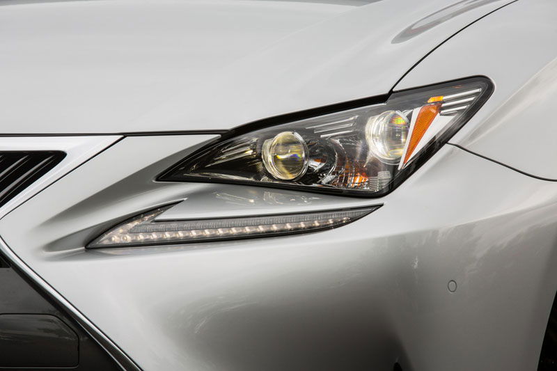
I’ve heard people call these mascara or eyeliner for headlights. I’ve heard them referred to as automotive jewellery. I’ve even heard people call them those little light things. But I’ve never, ever heard someone call them anything positive. I know, now the comments will fill up with people saying how much they like these ugly, stupid, tacky, useless accessories, but I stand by my point.
I can sum up my feelings for this design trend like this: even when I see them on factory stock high-end luxury supercars, I immediately flash back to the automotive aisle at Wal-Mart. I think that says it all.
4. Plastic covers on everything
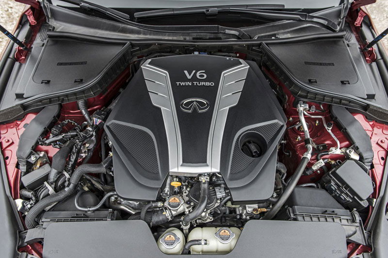
This has been going on for some time. I get it - manufacturers want to create a smoother look under the bonnet. Or do they just want to make it harder (and perhaps more intimidating) for people to wrench on their own cars? If the idea is to help keep the engine cleaner, engineers clearly haven’t removed one of these covers after a couple of years of driving to see just how much crap gets underneath. Again, here’s a simple weight-saving solution for vehicles that really need it. The savings wouldn’t be much, but every bit counts.
5. Basic controls buried in infotainment systems
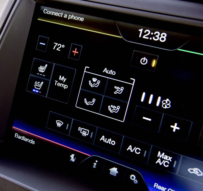
Time to bust out some science. Occam’s razor is a very old principle that basically says the simplest solution is usually the best solution. It’s not an absolute mind you, but it’s a perfectly logical concept to follow. Why then must automakers continue to bury such basic functions like climate control and radio selection within increasingly complex infotainment systems? There are many cars now on the road that require you to navigate screens to do something as simple as turn on a fan. Technology is good when it makes things better, but not when it’s used simply for the sake of using it.
6. Keyless operation systems
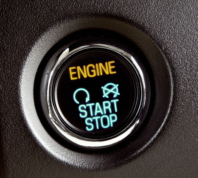
Here’s another cliché - out of sight out of mind. When you don’t need to physically use a key to operate your vehicle, it’s very easy to forget all about it. When you forget all about it, losing track of it becomes more likely. When you completely lose track of it, finding it becomes far more difficult.
I won’t deny the convenience of just walking to the car and having it unlock automatically and fire up at the simple push of a button. But the whole keyless operation thing seems to be solving a problem that never existed. You need to have it with you anyway - is it really that tough to just insert it into the car?
7. Low rooflines and high beltlines
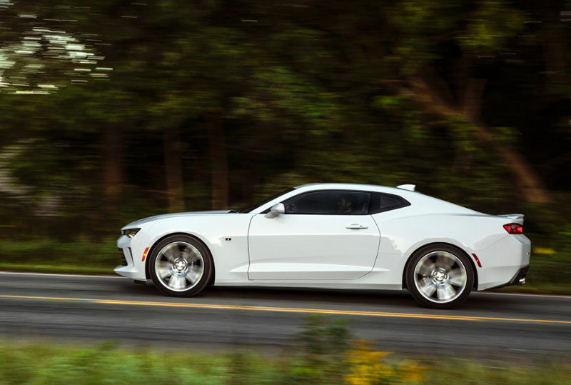
These designs look good. Actually, they look great. The Chevrolet Camaro pulls this look off arguably better than any other production car currently on the road. You’ve probably also heard about the Camaro’s terrible visibility, and this is why.
Aside from the scrunched windows that result from such designs, major blind spots often develop around the A- and C-pillars. Supercar drivers have known about this for years - it’s one of the vices of living with such a machine - but now we’re seeing this trend appearing more and more on every day vehicles. The last thing we need on the roads of the world are inattentive drivers in cars they can hardly see out of.
Comments
I disagree with all of your styling critiques.
I will agree with your hatred of the modern info-tainment style systems. I think that Lexus grill shown looks good.
Is it just me who really likes LED accent lights? For example on the new jaguars?
The circular turnable gear selectors, and electronic parking brakes as well.
I agree
Why would you lose track of the key if it will always stay in your pocket?
I agree with you in that I don’t want huge wheels, but they have merit.
Less sidewall deflection means what the tire is doing is more predictable and suspension engineers can do a better job. Ford called it controlled compliance in the 80s, when they made the huge at the time leap of offering 16 inch wheels and low profile tires on the mustang. The idea is to make alignment changes, weight transfer, etc the responsibility of the suspension and chassis, and it makes the car more predictable.
That said,without good suspension engineers the ride will be trash, and I hate 19inch wheels for the price of tires. Manufacturers clearly haven’t caught up to the trend with manufacturing costs. But bigger wheels mean you can increase the OD of the tire while still having great control of it, ultimately lowering temperatures of the tire under heavy loads like at a track day or spirited drive
100% about the low rooflines and high beltlines
I actually like oversized angular grills… And agree with the plastic covers point, those are fckng annoying
High beltlines are my #1 most hated thing about new cars. Whenever I’m in my mom’s 2015 Mazda 3, I never know where to put my arms since resting my elbow on the door would put it uncomfortably at ear-level.
Yes someone shares my views!
Pagination